Forums › English Language Forums › General › Suggestions

Search

Colorblind - pickup icon problems

28 replies [Last post]
Fri, 07/08/2011 - 20:45
Farashin
Legacy Username

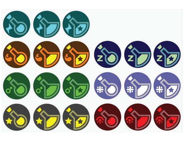
I'm red-green colorblind, so I have some difficulty with several of the pickup icons. Specifically, the fire, poison, and stun flasks all look the same to me, as do the freeze and shock flasks. Since all of the statuses already have associated symbols, I suggest you put them in the background or 'corner' of the icons.

I started trying to make a couple of examples in paint, but it wasn't going too well. My wife looks over and asks what I'm doing. I give her a brief explanation and she says "oh, I'll do it in illustrator." So 20 minutes later I have not an example or two, but a full new set of icons. Feel free to use these. I can also provide the file in .ai or .svg format if you'd like.

http://i247.photobucket.com/albums/gg136/Brahamut/bottle-icons.jpg

Fri, 07/08/2011 - 20:57
#1
angelgod
Legacy Username
...

well i dont see any problem with these, no1 loses with it some ppl win.
(ppl with vision problems playing video games, cant that agravate the problem somehow?)

Fri, 07/08/2011 - 21:02
#2
Boolet
Legacy Username
meh, makes sense to me.

meh, makes sense to me.

Fri, 07/08/2011 - 21:08
#3
solkanar512
Legacy Username
There's really no excuse for

There's really no excuse for there to be color-blind issues with this game. It's 2011, these issues should have been addressed in the early design stages of the game and when they only require a simple palette swap or 20 minutes in Illustrator it just becomes silly.

Fri, 07/08/2011 - 21:15
#4
Farashin
Legacy Username
I don't fault anyone for not

I don't fault anyone for not considering it. Chances are that most people don't personally know someone who is colorblind, so it would never occur to you that the red/yellow vial and the green/green vial might look the same to someone. I also have a hard time with the elevator screens, but the gate map is very clear, since you can hover over the icons and get text. You can do the same with the vials currently, but that's no good when you use a controller and you're trying to get the fire on RJ now, not the poison.

Also, colorblindness is genetic, it is not aggravated in anyway by staring at electronic displays.

Fri, 07/08/2011 - 21:22
#5
Quasirandom's picture
Quasirandom
I'm not colorblind, and I

I'm not colorblind, and I still don't know what some of the flasks are. I can tell what color it is, but don't always know off hand which color means what status. I agree with the proposal to put a status icon on the flasks.

Fri, 07/08/2011 - 21:57
#6
Ightex
I do believe the benefits of

I do believe the benefits of having status icons would be universal, rather than limited to just colorblind people. At the moment, the only way to remember which vials does which is trying to remember which color does what. Fire and Stun vials are similar in color (yellow) and I tend to keep switching the two, as well as sleep and freeze ones (blue).

I'm guessing than when picking minerals you don't really care which color to take.

Fri, 07/08/2011 - 22:01
#7
angelgod
Legacy Username
#6

think u re colorbind, fire is orange, the ones that look more similar are shock and freeze, i still set them apart easily ( i still agree to the suggestion )

Fri, 07/08/2011 - 22:18
#8
Dukesky
Legacy Username
+1

This is a good, sensible suggestion.

Sat, 07/09/2011 - 00:49
#9
Prezombie
Legacy Username
This is especially true with

This is especially true with the flasks, I would suggest having a colorblind mode that gives the icon an initial letter covering the top left of the icon.

There's only a little change needed to give all them a unique letter.

Curse and Poison are fine.
Fire and Freeze: I for ice.

Shock: E for electricity.
Sleep: Z for Zzz.
Stun is now fine.

Sat, 07/09/2011 - 01:43
#10
Squishat
Legacy Username
looks amazing

First reaction was how players who were colorblind would swap out the bilge pieces for different colors in Y!PP (other game), which was approved by developers/GMs.

Love the idea of the icons on the vials... even for non-colorblind people.

It took me awhile to remember what color did what (even though now it is pretty intuitive)

And the mockups look really nice, kudos xD

Sat, 07/09/2011 - 02:29
#11
Dwho
Legacy Username
I'm also color blind and I

I'm also color blind and I too would like this.

Sat, 07/09/2011 - 08:01
#12
sonicmega
Legacy Username
This is a splendid

This is a splendid suggestion, and the new visual is pretty darn cool. I openly support this idea and hope it gets implemented soon!

Sat, 07/09/2011 - 08:10
#13
Achim123
Legacy Username
as mentioned before, it would

as mentioned before, it would support ALL players, and it doesnt need much work to implement, i think.
i would directly use your icons, i like them really much.

thumbs up for this.

Sat, 07/09/2011 - 14:17
#14
Sanzenin
Legacy Username
+1

I'm not color blind but when I started this game it was hard to tell certain vials apart. I also use a gamepad and using the mouse to hover over the vial is not practical during combat.

While it's easy for me to tell which vials do what now the small icons would've really helped when starting out.

Good suggestion and nice mockups.

Sat, 07/09/2011 - 14:33
#15
Jadechao
Legacy Username
+1

These actually look pretty snazzy, and I know I always confuse which blue is sleep and which blue is freeze. Give this man a cookie and switch out those old icons please, very sensible!

Sat, 07/09/2011 - 16:09
#16
wenkuang77
Legacy Username
great idea!

It'd be great for other people who aren't necessarily colorblind, but just forget which colors are which. stuff like curse, fire, and shock I can recognize, but I have a hard time remembering which one's sleep and which one's freeze.

status symbol thingamajiggies for everyone! :D

Sat, 07/09/2011 - 16:54
#17
Reactbank
Signed! And the ones your

Signed! And the ones your wife made are great :]
This should've been done ages ago - OOO should be ashamed.

Sat, 07/09/2011 - 18:41
#18
Koffin-Kat's picture
Koffin-Kat
What the OP and Quizzical said.

"I'm not colorblind, and I still don't know what some of the flasks are. I can tell what color it is, but don't always know off hand which color means what status. I agree with the proposal to put a status icon on the flasks."

Agreed ^^
I'm not colorblind but I too have some troubles with remembering which color means which status.
I learned to recognize most of the flasks, but I'm still confusing the Stun, Shock and Sleep vials.

Also, the example icons OP posted look very very very good, and I think the Devs should certainly think about implementing this.

Sat, 07/09/2011 - 18:45
#19
Reactbank
Signed! And the ones your

Signed! And the ones your wife made are great :]
This should've been done ages ago - OOO should be ashamed.

Sat, 07/09/2011 - 18:54
#20
OverDingle
Legacy Username
It's a good idea, and I

It's a good idea, and I support it, but as things are right now, the game folder only has 3 icons for status vials (T1/T2/T3 versions)- when an icon is needed in game, it creates an instance of that icon and changes to palette to match the status effect, or something along those lines.

What you're suggesting needs one of two changes - either a unique icon for every possible vial, or having the game merge the vial and status icons at runtime. One upsets the filestructure a little and creates redundancies, and the other needs entirely new code to be written.

I have to say, poking around in the files to check is this is possible was an interesting experience. I wanted to check if I could add your vial images directly to the game (it'd help me a ton, I'm colourblind myself) but with the current setup, it's impossible to even do that much. But while I was checking that, I found some fun things... though I'm not sure if OOO would like me talking about it, so ima keep quiet on that.

Sun, 07/10/2011 - 02:40
#21
Vermilicious
Legacy Username
Excellent idea and great

Excellent idea and great icons. I don't see why they couldn't implement these.
+1

Sun, 07/10/2011 - 02:54
#22
mejezfeld
Legacy Username
@OverDingle I don't see why

@OverDingle

I don't see why they'd object to you openly discussing something you found in the files... I guess it depends on if you found them using tools that are commercially and freely available or if the knowledge can be used for gaining unfair advantages over other players (like some way to change Mist or Crowns held).

if it's stuff like unused graphics/sounds/monsters, go right ahead. I like reading about that kind of stuff.

Sun, 07/10/2011 - 06:30
#23
Crimson-Cat's picture
Crimson-Cat
Agreed

I find that a few of the vials can easily be mistaken, as they are right now. Some of the colors are just too similar. I agree with the OP that they should include an icon to denote what they are. It would benefit everyone, not just the colorblind.

+1

Sat, 04/14/2012 - 10:36
#24
Psycho-Dani's picture
Psycho-Dani
+1 to this

And a request for the .ai or .svg please? I am also incredibly in favour of this, my monitor makes reds and oranges really similar, and the little status icons are also perfect.

Sat, 04/14/2012 - 11:07
#25
Kentard's picture
Kentard
Was about to chide you for the bump...

But I believe this is a pertinent point to make.
As a previous post mentioned, "There's really no excuse for there to be color-blind issues with this game."

I fail to see why this isn't implemented.

Sat, 04/14/2012 - 11:59
#26
Mk-Vl's picture
Mk-Vl
+1

Not colourblind but agree with the concept

Sat, 04/14/2012 - 13:25
#27
Tapproot's picture
Tapproot
+1

Sounds good, but what about T1 pills and rem pills?

Sun, 04/15/2012 - 01:53
#28
Zaeyon's picture
Zaeyon
+1

Good point, I still get confused over shock/freeze/sleep vials orz. Would make players life easier if the icons were made not just different in colour but also have different images.

Powered by Drupal, an open source content management system