Forums › English Language Forums › General › General Discussion

Search

What the heck are these new accessory icons

8 replies [Last post]
Wed, 02/04/2026 - 12:54
Fangel's picture
Fangel

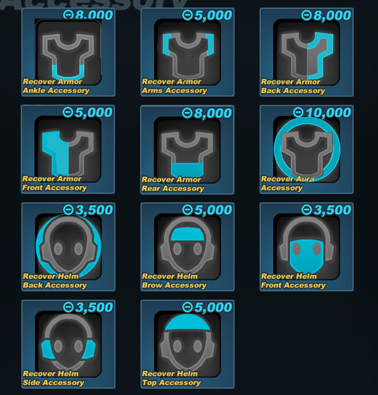
I'm typically not one to be super critical of changes that are fundamentally positive for the game, but I've gotta say - those new accessory icons are absolutely horrid to look at.

I understand the need to revamp the visuals to better relay the actual positions, and while I'm not too happy with the full body in the icon I could live with it. But some of them just radiate that "graphic design is my passion" energym.

The head slots are mostly fine, but the armor ones are just awful.

Some constructive criticism:

The "aura" ticket should remain an outline of the body. Filling in just part of the background looks super tacky.

The "back" accessory should make an outline of the chest, and not be filled in.

The "front" accessory should outline the chest, and be filled in.

The "rear" accessories should outline the waist, and be filled in.

These adjustments would bring them more in line with the existing icons. You can also make the body icon a bit larger so that it occupies more room on the icon now that the highlights are on the body rather than most of them being behind it. The rear and back really need to be changed as they're practically the same - this is the same issue the front and back armor icons had in the past and instead of fixing them we've just moved the problem somewhere else.

Wed, 02/04/2026 - 13:15
#1
Fallen-Feces's picture
Fallen-Feces
asdf

Though I agree the aura is definitely a stinker I think most of these new ones are fine. Maybe for the front ones they could be outlined and filled but for the back and rear accessories I think what's there now would be much clearer to understand than what you suggest. If anything, I don't get why you'd suggest the rear be filled in. Are you not using the fill to suggest a frontal area? I do agree on making the overall body icon take more space.

The old icons would be pretty much impossible to rework to clearly suggest what's being affected. I totally get why this change had to happen.

Wed, 02/04/2026 - 13:23
#2
Ainogommon's picture
Ainogommon
I hate the new aura icon

I am ok with all the new helm icons
But the body, mostly the aura. I understand some of the old icons are hard to read. But the new icon also introduced a readability problem. The new icon solved some of the placement issues. If zoomed in, these new icons make sense and look like body, but from afar, it's hard to read.
Plus, the icon also now has the same colour index as the old one. which makes the item icon colour look slightly off.

I made a mock-up edit of these new icons to be similar to the old ones, and also attempted to solve the placement readability issue.

Wed, 02/04/2026 - 15:58
#3
Fangel's picture
Fangel
Rear and back look too similar

The rear and the back accessory icons are just circles behind the body. The rear icon covers the entire back, while the back only covers the top.

At a glance, it would be difficult to determine which is which. With time it may become easier, but the first impressions I have are "which one is the back?" Because"rear" seems more back than the back does.

I also feel like the focus on circles is losing focus on legibility. More shapely icons is easier to read. In the old system, the only "circles" were the helmet back (which made some sense as it was highlighting the entire behind of the helmet) and armor aura (which made sense as the aura encompasses the armor).

While I'm fine with having armor back be the circle icon to bring parity to the "back accessory" visuals, I don't believe any other slot should be represented as such.

Wed, 02/04/2026 - 20:17
#4
Spark-Of-Kill
The new helmet icons are fine for the most part

My main gripe about the new icons (both helm & armor) is that they're hard to see well when scaled down. (when hovering over an armor or costume for example). All detail is lost when the icons are resized that small, I can hardly tell what I'm looking at.
(It doesn't even look like a body tbh)

The edit that Ainogommon made does an excellent job at differentiating the placements of each accessory type. And as Fangel said, some of the armor icons look very samey

Wed, 02/04/2026 - 20:24
#5
Fallen-Feces's picture
Fallen-Feces
@Fangel I can see what you

@Fangel
I can see what you mean for the rear vs back thing. If the designers could find a better way to convey them then I think that'd be a good idea. I don't really have any qualms with the circles being there although I concede that the front slot one does look a little off with a circle just slapped on in front. They work better in the background being partially cut off tbh.

@Ainogommon
The issue with that edit is that the old torso image is just impossible to adapt for the new slots. Not only were the old torso icons already hard to read, but without the context of the text surrounding the icons, those mockup icons are just complete nonsense to me. The only icon in that mockup or even the originals that ever immediately made sense at a glance was the aura. Genuinely, how is anyone supposed to communicate to players only using that torso icon as a base, with no text, that they're referring to an ankle slot? The lowest body part shown there is the waist.

Keeping the old icons and just adding the new ones for the new slots doesn't work either. All those slots are for the same armor piece: the torso. If icons which referred to the torso swapped between a stick figure and a torso pic on a whim then we have a consistency problem. Admittedly, the new icons still do introduce a consistency problem because a lot of old torso related things throughout the entire game still use that icon style, but hopefully you at least understand what I'm trying to say here.

Thu, 02/05/2026 - 17:21
#6
Hatn's picture
Hatn

I may be a bitter vet after this update but I really don't like how the new icons have turned out, they look like a badly done UI mod imho.
I wish the icons adhere'd to the old icon style but with a more modern twist. This is just...idk... it doesn't feel like the Spiral Knights I once knew.

The old icons were able to convey where on the body the accessory would be, I have to squint at my screen now to see the lackluster amount of pixels that exist for some of them

Fri, 02/06/2026 - 13:03
#7
Spring-At-Peace's picture
Spring-At-Peace
Not a fan; Changes need to be done.

I could get behind the new changes if consistency had been maintained from the old versions, but as it stands, I cannot understand them.

The visual changes are interesting regarding the body accessory icons, yet as a long-time player, it's not as readable, and the details get lost the smaller the icon is. This also applies to the Helm Accessory changes since I can recognize the subtle changes outside of the new Helm Brow Accessories. From the perspective of an artist, you need to consider your "thumbnail" when it comes to images being shrunk down for readability. Smaller details easily get lost compared to larger shapes and visual focal points that help give structure to the image you're creating.

Here are the pointers I found to be, in order, the larger to smaller differences that I've picked up looking at the new icons outside of the body silhouette:
- The details regarding the face silhouette are too small and don't appear as apparent when shrunk down; They don't convey what's exactly being described at a glance
- Color Patterns are off in both Saturation and Hue, making them an actual eyesore for several Color Schemes in-game (Heavy being the worst contender rn for basic colors)
- Helm Front Accessories added the Secondary Color Pattern to the Eyes, making the icon less readable at a glance
- Helm Back Accessories have been reversed, making it more confusing regarding consistency
- Spot Gradient Background is gone/different, and doesn't make the colors pop due to being a completely different hue
- The "glow" isn't as condensed and much more subtle

Here's a photo reference to a few pointers I've listed, including a color adjustment for the new icons to match the older versions more closely. The background, of course, is still very apparent and could either stay the same Hue w/ a black gradient or actually be reduced in Hue.

Either way, I believe that if there were several changes or at least one subtle change to make the icons pop out better (i.e. Making a white glow around the accessory visual and/or making the background a darker gradient), then I believe the new icons could work down the line. The current state they're in doesn't feel properly done and creates confusion among the playerbase.

Fri, 02/06/2026 - 13:45
#8
Fangel's picture
Fangel
The colors definitely need some touch-ups

I didn't even really clock that the colors were a disaster when I first wrote this - I was only looking at the larger icons from a screenshot of the supply depot unbind tickets. The smaller icons plus the color changes are really jarring, and the comparisons you've shown above certainly showcase just how uncanny it is.

I've since also opened my inventory and been flashbanged by my accessory list.

This has been a fundamental issue I've noticed with cosmetics since we started ramping up new additions. The colors have always seemed off and I think a lot of that comes from highly saturated colors and the wrong part of the colors being focused. The divine wizard set is mostly brown with divine is a light tan as the primary color, for example.

I understand we probably have a new art team on the job here, and while I would prefer new things added over nothing, the consistent lapse in quality checking is becoming very grating. Some sort of "community consultants squad" would go a long way, and I'm sure many folks in the community would step up and be willing to offer their time without a second thought.

Powered by Drupal, an open source content management system