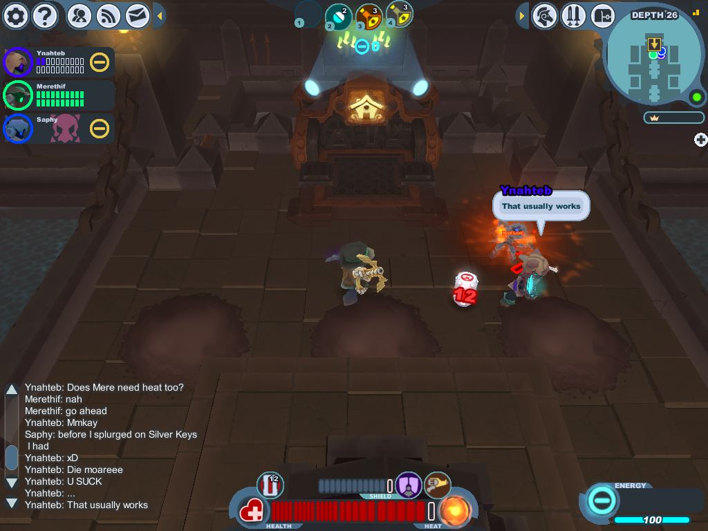
Monster health bars = yes
Everything else = why
If you want to give the game a new feel, how about some content? Like the core.

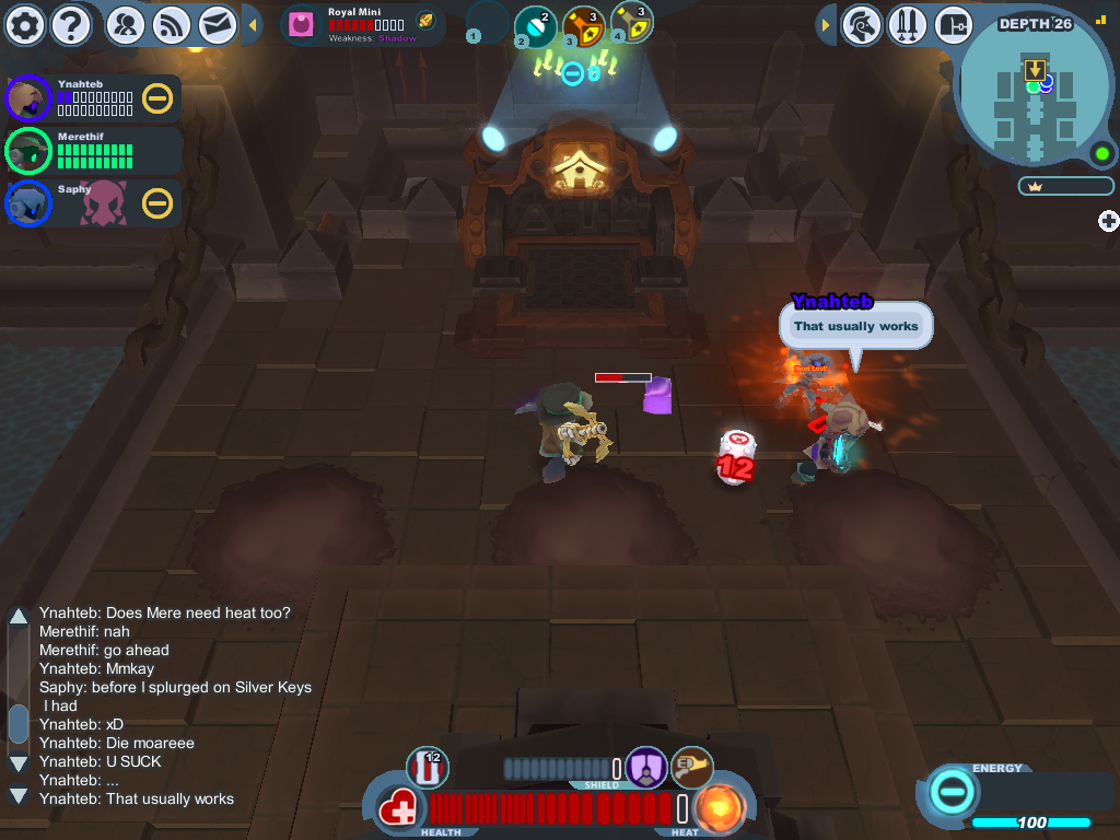
Monster health bars = yes
Everything else = why
If you want to give the game a new feel, how about some content? Like the core.

I'm all for this new UI, however is there a way that we can revert back to the old UI? I would really appreciate it since it is the UI that I have grown to love in SK.

Yes, it better. But still, funny. Why is everyone mentioning shield bar?! I really wonder how some of you managed to grind so far as you did.. I cannot understand how can that bar even be useful, are you tryin to tell me that in the heat of the battle, while 5 monsters are attacking you, it's easier for you to look up at that bar?! That is not logical, if anything, it's dumb. No offence, but it is.
If you're busy comboing, charging, and attacking, you won't have the opportunity to activate your shield and see how strong it is. And sometimes, you just need to know. It's also good for taking down data for Wiki-updaters.
"The weapon wheel is useful. I like knowing which weapons are next in my list."
Again.. do you even think about what weapons do you take with you? Do you have some super extra weapons slots so you can carry 10 weapons and you get confused? For the love of god, most people have 3 weapons! Is it really that hard to remember on which slot they are?
You'd be surprised, Daemiax. Yes, it really is that hard to remember which slot they're on. I have a hard enough time figuring out which number to press to get a vial. When you're in combat, you can't afford to sit there and try to remember how far to scroll your mousewheel to get your choice weapon. You just scroll until you find it. If you guess wrong, you may find yourself trying to lift a bomb instead of swinging your troika to save your hide.
"I like how everything combat-related is on top where you'll use it, and everything non-combat-related is on the bottom, where you're not looking anyways."
If you still dont get it, Eltia shared a link about that.. Go and read it please.
I'm not about to go through eight pages to find Eltia's link. I do, however, recall reading someone saying that the positioning of the UI either doesn't matter or blocks useful lines of vision. I've heard both arguments. I personally believe that the new positioning is helpful, if only a little bit.
"Enemy health is now displayed. It allows for better tactical decision-making."
Like everyone who mentioned this, you obviously prefer the game to be easier. Most of us don't. I believe at least 80% of players would like this game to be harder, not easier due to some visual HP bars over enemies. But hey, I can turn them off, so no problem there.
It only makes the game easier to the extent that teamwork is improved. When teamwork is improved, the levels run smoother and easier. If the game is to get any easier, it needs to be by encouraging teamwork, which this feature does in spades. I don't want stupid, artificial challenges, like not being able to know which enemy to strike to help your teammate out. I want smart challenges, like enemies with advanced A.I.s, or cleverer puzzles. Not knowing how much health an enemy has is a stupid, worthless challenge-booster.

That update in short:
-Tragic ui (I want old NOW)
-Tragic event (The same as year ago. Easy, boring...)
-Tragic cake-mobs textures
-Tragic event prizes (Candles? Party hats? Cupcake helms? DafuQ?)
-Tragic vial icons (O m g...)
-Tragic vitapods
-Tragic chat position
-Tragic avaibly of energy meter
Tragic update ._.
@Down, just writed post fastly ._.
U found typo.
Ur cool.

"Tragetic" English.
If you mean "tragic", I'd agree with you on some of those points, but I can't make heads or tails of what you're saying.

Some people are "smarter" so to speak and don't need soo much help.
For those, it's bothersome to see information they already know, covering 0.1% percent of the screen.
So if the wheel/shield indicator were toggleable everyone would be happy.
Ok, so here we go (Warning, this going to be LONG. Also, not-english person writing here, may contain grammar-errors.)
The devilite nerf? I don't give a flying badger about them. Those little jumpy buggers were a pain to me, but then again, I never bothered to get the right equipment against them so I really don't care.
The new UI and viusal effects HOWEVER...
I'll admit, I am not completely unsatisfyied. The health-bars over the monsters heads? neat. unnecessary but neat. and deactivatable!
The new 'shinier' look with the gradients and reflections does not look as bad as I presumed it would, it still fits the general style of the game and adds a little something. The new UI-Layout however I think is just one giant calamity...
INTERFACE 101: the less clicks, the better!
Not only that the general ce/me-count has vanished for the sake of some buttons that were far better placed in the top-right, now you have to open your inventory to check how much energy you have for crafting and travelling. To buy energy you have to open the inventory first, because it is the only access to the e-stats.
The 'picture' of the character in the top-left? Useless, ENTIRELY useless. It serves no other function then to block even more screen-space and act as a button for functions that are rarely used OR already have button directly on the screen (GoToGuildHall). I KNOW how fancy my character looks like game, thank you very much, now please make it go away.
The new placement of the health-bar is awful, at least to me. Thanks to the camera-angle the knight seems closer to the lower edge of the screen rather then the upper edge. Putting the vital informations (health, status-effect, vitapod, weapon) on the lower edge of the screen is creating the shortest way for your eye to move up and down for a quick glance. effective, easy to read, quick to understand. The upper right corner is further away, takes longer to get to and to read. Making the health-pips slightly bigger than they were before and adding a really tiny %-number didn't solve that!
The shield-meter is kinda neat, but again in the end unnecessary. the color-effect directly ON your shield is still there, and when I'm getting heavily hit I think I've got way more imortant stuff to do than look at that bar. And since there is no way to calculate what amount of the bar a hit will take away BEFORE I catch the hit, it doesn't add any useful information. That plus the fact that the bar needs about a second before it actually starts it's animation renders it completely useless, if compared to the system that we already have.
In a heavy T3-Battle I would have already catched the critical/shieldbreaking blow before that thing has even finished moving for the last two registered hits.
My advice: Locate the health-meter/shield-meter back to the middle-lower edge and make the damn thing react faster, than it might be worth using.
The weapon-wheel... ok, the one in the dev-team who thought that this would be a good idea, please put a hand up so I can violently hiss at you. Why, for the sake of cradle, do you have to show me A STYLIZED picture (and name) of ALL my loadout-weapons including the one I chose, when right NEXT to that picture my character is HOLDING that very weapon in all it's textured 3D-glory. WHY? To steal more screen-space? If yes then great job, because it does a really great job at that. Popping the weapons name up over the (old) health-meter might've added something useful for starting players, but I know the arsenal in and out, let me deactivate that god-forsaken thing!
The next thing would be the new damage-effect... do you want to punish your artists, three rings? Because every indivduality certain weapons had in their slash/hit-effects are now covered up by these gigantic blue and yellow flashes. I mean hell, SK-Combat can already be quite a visual cluster-chaos with the brandish-bursts, retrode-beams, pulsar-shots and bombs going of. Adding these massive flashes to EVERY player and EVERY hit is not in any way helping. The dmg-number already shows if the hit is effective, normal or ineffective, so did the old animations: small gray, bigger blue, big yellow with stars, but now they're all the same size (what was that about screen-space again?).
The little chart in the top-middle/right that displays monster-names, and stats is (again) neat for new players, but utterly useless to anyone with more than 20 hours of effective playtime. Let me deactivate that please, I don't need it, and it's distracting.
The new vial/pill design isn't something I particulary adore. Again, the old/stylized pictures made it way easier to read on a glance what and how much you were carrying around, and the 'fake' 3D-design does not mix well with the fact that it is still a 2D-sprite. But that is not a dealbreaker, I could very well deal with that.
The activities chart isn't that bad, but Interface101 strikes yet again. You can have that thing either take up a massive portion of your screen that I'd rather fill with beautiful scenery, or you have to use an additional click to get to it. Navigating an UI should be fast and straight-forward, not a clustered spreadsheet nightmare...
The fact that everyone has white names and grey mini-map icons now is something I'm kinda really confused about.
I'd guess it is a bug, because why would you let us choose custom colours in the first place when they are not going to appear anywhere but some minimalistic textures on our armor.
And jesus christ, can you add an option to deactivate the rank/guild-texts under the names. I don't care what everyones rank is and I can still se the badge next to the names. Right now, the name above a persons head is almost bigger then the knight itself, and crowds are now more overlapping text than anything else.
Zoom function? eh, I really don't see the appeal, but it doesn't steal more screen-space or block more useful buttons so I'm totally fine okay with it.
Just give us an option to switch to the old UI until you get your new UI properly sorted out, maybe add the gradients and shiny effects as well as the more useful additions to the old one and everything is nice. You'd have a new fresh look+features to be happy and excited about, the comfortable layout is still there and we don't have to take a 3-week correspondence-course on how to navigate through that abomination that is status-quo right now...
Currently I can't even imagine what people with a less stable connection or a weaker pc-setup are expiriencing, but from what I read here and hear ingame it seems that either the new UI or something else is poorly optimized as well, causing lag. Just give us the option tp deactivate all that fancy stuff and get back to the core (no pun intended) ok?...

I do like the enemy health bars. Quite a bit. And I don't dislike the weapon wheel; Though I don't need it, it's a cool idea and I like the look of it.
The rest of the HUD looks really bad, though. The old one's flat colors and stylistic item icons went perfectly with the rest of the game, but everything looks kind of gross to me.
I really don't like the placement of everything. The health bar at the bottom center was perfect. I could always easily watch my HP, but looking all the way up to the top left is apparently trickier than it seems, and status effects are very hard to watch now. (I play on a very big screen). The shield bar is unusable, as I'm always looking at my knight to dodge attacks, shielded or no, and I just can't look up, all the way into the top left when doing so. It's also really hard to see the depth on the map when it's tucked away like that, and the inability to see either crowns or energy isn't good. The new teammate health bars make it very, VERY hard to see who's up and who's down in the heat of battle, and who still needs a vitapod.
The old HUD was perfect. Absolutely perfect.

I actually LOVE the new UI.
My only issues are:
A. Can't move dungeon items to empty slots in the inventory
B. Have to open my inventory to view my crowns and energy count as well as to buy energy but I can live with it.
C. Faces for the top left corner using the same system that the original mission complete screen used with all the bugs intact (like the snipe on the sniped stranger hat appearing as a big orb that clips through the hat and into the knight's face)
D. The Weapon Wheel doesn't 100% work to what I'd expect.
Other than that. I <3 the new UI. A radar that actually functions as a radar, invites no longer interrupting you, a shield bar, and portions of the Hud can now be hidden.
as for all the other new stuff? No complaints here! The new vials and capsules are cool, the m-m-m-monster Health bars rule, as for the repeated event, Well I missed caketastrophe and tons of other events last time so I'm someone who has been waiting for them to repeat events so I could catch them this time around.
Ok, I know that the GM will never read this, but anyways. I'll point out the things I find bad in this update.
The Event:
-Nothing that bad really. Just that I would be cool if some new things were added.
The UI:
(OhBoyThereWeGo.jpg)
-The most Important: CR/CE/ME. They are now practically gone. I need to look at me Energy ALL THE TIME. Now I have to open the Inventory.
-Portrait: It's just Useless. Why do we need a picture of ourselves using space in the HUD?
-HP/Shield/Heat: They were a nice idea, but bad execution. Now it's kinda awful to look at the HP when in-battle. As well, when in party, you don't exactly now how much HP your friends have. It may be confusing when there's only one alive and needs to rev the other ones. The Shield bar, seriously, why? The Color-indicator was already fine.Also, it's awful when doing Shield-Cancel/Bump, as how the bar shines. The heat indicator is actually fine. I liked the Old Style, the Party Members HP was actually easy to see.
-Weapon Wheel: The wheel looks way to big and sometimes is Awful. When Holding a Key or vial, you can't see which weapon you have. So, for people using +3 weapons will be kinda confusing. The Old HP-Indicator was actually good; It showed your HP, your Weapon and the Vitapod.
-Vials: They are now using the space that was for the HP. They look kinda ugly. The Frozen/Sleep vial are confusing as well as Fire/Curse.
-Vitapod: As a lot of people actually said, now we are going to be jerks for free!
-When being in-battle, everything SHAKES when you are getting hurt, that's awful.
-Haven: Now that all the names are in white, it looks awful, monotone and boring. One of the cool things was to look at all the names with their own personal colors.
-The location of the "Tabs"/Shorcuts: It's kinda awful, since most of us get used to click at the Tabs in the Upper part of the screen. And it will be kinda awful to learn all of the short-cuts.
-The Lack of Gears. They are the essence of Spiral Knights, why would kill them?
That was most of the things that I find bad in the new UI.
The Devilite Nerf:
-I know they are kinda hard, but they are the last challenge that was on the game. No need to actually nerf it.
Overall: 3/10 Needs a lot of improvement. Would not totally play.
Instead of a bar, the shield icon could be transformed into a full fishbowl that will slowly empty.
Like many old RPGs displayed life and mana.
http://1.bp.blogspot.com/-eQ-jllXKkww/ToAQLizZTlI/AAAAAAAAAE8/LCXy9P3Pep...
It can save plenty of space.
Want
pony
button
back
D:
it was so much more fun than this boring person thingy we have now...
edit:
to be less negative...
+ activities side menu. way more sorted than those buttons on top center.

...and still there's no response from the devs. Are they blind? It seems they don't read the thread or they just DON'T WANT to read it. We need answer,as soon as possible.It looks like the Core has been opened and all the CHAOS it was containing has been released, ruining the whole game...
I can't play with the new UI because I die every second because of all the useless changes.

"If you're busy comboing, charging, and attacking, you won't have the opportunity to activate your shield and see how strong it is. And sometimes, you just need to know. It's also good for taking down data for Wiki-updaters."
If you are busy comboing, charging and attacking, your shield should be full.
"You'd be surprised, Daemiax. Yes, it really is that hard to remember which slot they're on. I have a hard enough time figuring out which number to press to get a vial. When you're in combat, you can't afford to sit there and try to remember how far to scroll your mousewheel to get your choice weapon. You just scroll until you find it. If you guess wrong, you may find yourself trying to lift a bomb instead of swinging your troika to save your hide."
I put pills in slot 1, remedy in slot 2, poison 3, etc. That way, I always know what slot or what button I need to press. Same goes for weapons- slot 1 is my main sword, slot 2 is my gun while slot 3 is sword/gun for "special" type of enemies, such as Healers for example. Wake me up in the middle of the night and I can tell ya where my pills are, and where my Combuster is. True, if you guess wrong, you are dead. But that is why you don't get guess. You learn it (great job OOO, I can't move my vials and pills anymore. Why did you have to change that? Give me one good reason! Now I have to take them all out and collect them in the right order? Like a [as you would say, silly person]).
"I'm not about to go through eight pages to find Eltia's link. I do, however, recall reading someone saying that the positioning of the UI either doesn't matter or blocks useful lines of vision. I've heard both arguments. I personally believe that the new positioning is helpful, if only a little bit."
I think the link was on the same page as my post mate. Make things harder on yourself, your loss. That post clearly describes what is wrong, or what was good about previous UI. And if that post is not enough, have you ever played any other MMO games? If you haven't, well, they mostly all have HP in the same spot. For a reason.
"It only makes the game easier to the extent that teamwork is improved. When teamwork is improved, the levels run smoother and easier. If the game is to get any easier, it needs to be by encouraging teamwork, which this feature does in spades. I don't want stupid, artificial challenges, like not being able to know which enemy to strike to help your teammate out. I want smart challenges, like enemies with advanced A.I.s, or cleverer puzzles. Not knowing how much health an enemy has is a stupid, worthless challenge-booster."
You need a HP bar to know which enemy to strike to save/help your commerade? If anything, not knowing the HP of monsters makes it more fun, more random. If you still don't know how many strikes/charges your sword needs to kill a certain monster, you really should go back to basics. As for teamwork, it's not rocket science, it's common sense. I really wonder what kind of people are you playing with?
I do agree with puzzle type enemies or some advanced AI.
EDIT: You do know that you had an icon before, for a weapon that is in the knights hand? Yes, it was small.. But it was there. It was as helpful as is this new wheel, which, beats me why, has annoying sound to it. Yep, we needed that. I need to hear clearly when I switch weapons. Doooh.
I wonder about GMs as well.. it has been 24hours, yet not a single reply. Just tell us "ok, we are working on it or something"!!!!! It would help a lot, just knowing we are on the same page..
I actually moved around vials just a few minutes ago. HUD lock active?
Seriously, we don't need it, that and the giant portrait of our knight stabbing at the corner of our eye.
No, I checked HUD lock first. I couldn't move them, I could only use em or throw them on the floor. And believe me, I tried.
Hmm.. I think you can't move a vial from one slot into an empty slot, while you can move them if slots are taken (as in moving pill from slot 1 to slot 2, if slot2 has remedies?)
Which still, is stupid. I want poison in slot 3. So if my first pickup is a poison? I can't move it. Nice.
ˇˇYep Rinzi, probably you are the only one.

I'll be honest I was skeptical about this update until I actually tried it out.
Funny that there was a Devilite nerf right when I find out how to actually manage them well in battle.
Am I the only person on the server who likes the entirety of the update?
Feels good, man~
My only complaint is that I wish there was a hotkey for Gate Map. :<
Link to why Health Bar relocation is a big deal (and why utility belt at the bottom doesn't make sense).
TL ; DR. The field of vision (or center of focus) in SK has always been at the centre, which makes eye-hands coordination easier. This new UI is forcing us to rewiring our field of vision to upper left. The utility belt relocation overlooked the simple observation that when people click and drag, they often drag down, never drag up. This is due to historical reason (wired mice have their wires attached at the top 99.99% of the time) and we are already used to click drag down more than click drag up.

Too many posts against this update, yet no action taken yet? Interesting.
From my questions ----> 60% of SK players dont like the new "look" (and if find guys to like it, they dont like it so mutch)
SK must stay on the good old character which make this game unique!!!!!
Thanks for read this.

Nice short and straight to the point, listen to this Knight!
- OPN's Divine Crusader

I really can't say I'm too happy with this update. I have a long list of things that just irks my soul when it comes to this update, but I'm not here to share that with you. There is already an abundance of justified feedback on the forums regarding the negative features that came with this update. Instead I want to focus on what I feel are the positive features and changes that were brought forth with this update.
1) The chat box has a scroll bar now. People have been asking for it for a long time now and you've finally delivered. +1 for that.
2) New buttons to go directly to the Guild Hall and other places. A bit for a convenience feature, but it is nice to have.
3) The heat indicator is pretty cool looking when maxed.
4) The new hp bars (the small ones) are very useful, especially for gunners. The new mini hp bars goes a long way towards making Catalyzers an effective and considerable weapon. Now people will know when a 'charged' enemy is near death and not kill it before the gunner can pushblock it into another mob of enemies and detonate it (assuming people of at least average++ intelligence). This also allows gunners to single out targets and effectively reduce numbers without having to guess or keep track.
That's all the positives I have to say about this update. OOO, it is very clear that a lot of people are unhappy with this update and the apparent direction that this game is headed in. You have a vision for this game and a destination you want to take it to, but sometimes it can't hurt to stop for directions or take a detour either. The players are the very soul of this game and without their continued support, most of SK might not have been possible. A lot of those players are upset right now, and over such a trivial aspect of the game too (trivial compared to ___). Some will adapt to the changes with time, but what of the ones that won't? Are they not worth consideration because they share an opinion that differs from your vision? All I want to say is that it would make a lot of people happy if you gave people the optional choice to have a UI layout similar to the previous style. I know this isn't hard for you to do considering what you have showcased so far and have proven to be capable of (and also based on my experiences with C#, jMonkey, and Unity3D).
I have said what I've wanted to and I've given feedback where appropriate. I want to thank those among you who have taken the time to partake in my opinions.

Been waiting for new content to jump back in, but even with new content "battle sprites/new levels/etc" I don't feel like I could come back and play because of this clunky ui. Why not just add a option to use the old style? I have a feeling the majority of users would use it over this new one.
@Eltia
Thanks for sharing link! That thread really needs to be moved to General Discussion.
EDIT:
@Zeka
I agree with you. Especially that maxed out heat indicator looks nifty (really, no sarcasm).
Of course it could look as nifty if it stayed where it was in original UI.
BTW, sadly you can't replace new icons with original ones. Fire Vial icon looks differently, but is acceptable, but Stun Vial icon looks really bad. Replaced Health Pills and Remedies looks a bit different too but nothing horrible. The other vials and confettis looks the same as before.

Its sad because I really wanted those anniversary hats, but I can't make myself to play now. Too upset
I love the new UI for the elevator espacally when you done you mission its AWSOME.

+ chat scroll bar
+ monster HP
- giant pointless character portrait (the old small ones were fine)
- undroppable vitapods. why? to stop skilled players from opting for a challenge and keep from giving better pods to squishier teammates?
- vials and caps cannot be dragged from one belt slot to another anymore. why? it was fantastic when I discovered I could rearrange my belt items without dropping anything (before i'd had plenty of noobs steal my caps just because I wanted them in a hotkeyed slot.)
- not even an option to bring back the old, unobtrusive, always-on crown and Energy counts. At least give us an optional tab like all the other fancy crud, eh?
- nerf of the only monster type that really challenged end-gamers, Devilites. Why? And if you had to nerf them, why not reduce the range of their projectiles instead of their speed?

Updated my post with more ideas: http://forums.spiralknights.com/en/node/77805?page=3#comment-682080 hope you don't mind if I link it.

+Windows appear faster than the old UI
+You can hide icons
+Elevators look cool (not that useful or anything, just epic lol)
+Good mini map. (But I want it to be personal colour, not friend/guildie colours)
+Chat scroll bar
+On old UI, my screen froze when I hit Tab key (Inventory/Loadout/Character overview) but on this new UI it does not make my screen freeze.
-Everything changed but MAIL.
-Too big portrait, I know who I am.
-Portrait option? WTH I CAN LEAVE MY GUILD SO EASILY RAGE QUIT MWAHAHAHA
-Preferred the old invitation system, even if you had HUD lock on, you could click on it without unlocking but now we have to unlock to accept the invitation.
-I barely look at left top to see the health...and I dont notice my health...just need to get used to it but left up is further than middle bottom from your character (maybe its only me lol)
-You can't see if party members are on elevator or not
-hard to recognise that your party members are dead. if they are ALMOST dead or completely dead.
-DAT WEAPON WHEELE DO YOU EVEN PLAY LOCKDOWN DEVELOPERS! OR IS ANYONE GUNNER IN THE DEVELOPER TEAM?
-No vitapod drop? you gotta be kidding me, WE CANT DO NO VITA VANA PROTO CHALLENGE NUUUUUUU
-when you are closing the inventory icons' tab, chat is floating looks weird
-CANT SEE ENERGY (Crown=meh) WITHOUT OPENING INVENTORY WUT?
Well, I rant a bit but it looks cool, well...yeah...cool....?

+1 Ednodvetri
I can't wait to know what the developers are gonna say !
Pre-feedback:
or "We are so proud to have been able of turning a well designed interface into something even more old school by taking the worst of the 90's korean's RPG for much more authenticity and luring everyone with the lack of new content. We will raise the pay of each one who have taken part of this to continue that way. "
or "The events were actually good, so we are gonna keep them forever, why change perfection ? Who need more costumes anyway, or suggestions forum. LOL ! We keep it that way."
=> I will quit the game as quickly as possible!
And will try to bring most of the friends and guildies I made there with me on another one, maybe try to create a new one with the same mechanics and put it on Kickstarter to see how many million players actually agree with me.
We actually have few options to consider:
. Take the time to test the new content in the test servers for more stable releases in the future.
. Actually listen more to the player's comments, and trust them because those who criticized the UI update and raged all at once might not have been totally wrong. Raging here is a proof of true love in the first place, if there was none, they should have moved on to something else without looking back.
-> "We are going to return you the old UI and question the community about the features that should stay, those who need to become optional, and those who were total fails. We apologize for the last ones, but hey everyone make mistakes." (RSS too, but too late now ...)
=> This game will remain the only one in my gamer's heart(s), continue to invest myself more and more, day by day. Maybe marry a GM, who knows ?
Sincerely, Hemsy. (>")>)))

So I'm coming up on 2 years playing now. Not exactly someone new. This update was horrible overall.
Things I like:
+percentage of health shown
+chat scroll bar
Things I'm meh about:
*Shield level shown (we already had a decent system for it)
*Monster health (honestly it's kinda much for everything to have it, I'd prefer bosses only)
*Activities bar (would be dislike if I couldn't minimize it to the side)
Things I dislike:
-health/portrait/shield showing up in haven
-health/portrait/shield take up too much space, especially the portrait
-portrait does not show accessories such as glasses
-bottom orientation of friends/loadouts/menu/etc (seriously, what game doesn't have them at the top? it's awkward to look at and honestly kinda awkward for my wrist)
-new vials>> minus minus minus!!!! The old ones were MUCH easier to tell what a vial was (as in fire, ice, posion, etc)
-weapon change wheel (gets in the way of combat at its current position, obnoxiously large... honestly for any non-noob even the old icon at the bottom of the screen wasn't needed since 95% of people I know already know the order of their layout without looking, but this is overkill and just gets in the way)
-vials on bottom
-names of buildings popping up as long as you're in front of them (really, come on, I know what the AH is)
-personal color not showing for names AND ESPECIALLY NOT ON MINIMAP. (I like being able to distinguish a guildy or run partner by color on the minimap, and the name color was part of the reason I bought a color change in the first place)
-nerfing devilites (how much more noob-centered are we going to get? We don't even need to hack to get a "God-mode" any more, any decent player is now already in God-mode compared to the game now. I'm afraid pets might make it so easy there's no fun in playing)
I'm not used to use this forum, but I really do need to give my feedback on the GUI update.
The old GUI was awesome, it was simple and understandable, I really can't see why OOO have decided to change it, but if OOO really want to make us happy, all I can say is: Give us back the old GUI! And if you don't want to waste all yours efforts into programming the "new" GUI, blend some of its (few) good features with the old style.
These are the good features given by the "new" GUI that could be added to the old GUI:
- Monsters on Mini-map;
- Shield bar(but don't make it too big, a height of 3px and the same old-HP-bar's length is enough to keep track of our shield recovery rate. For every other situation the old shield color is enough.);
- The chat's scroll bar;
- Awesome action poses from the elevator.
I won't keep discussing it anymore, but if OOO want to keep their players they should bring us back the old GUI as soon as possible.
@Randomzz
I agree with most you've said BUT actually you can drop vials and pills. Nothing changed here (yet it was easier to drag&drop down, then up).
The enemy health bars allow us to coordinate which enemies to attack. 3 healthy enemies are less dangerous than 4 damaged enemies. It's not so much for saving a teammate's life as it is for encouraging teamwork and coordinating the players.
By the way, Eurydice noted elsewhere that it's easier for the GMs to tally the feedback when it's all in one place. So if they care about the ease of tallying the feedback, it follows that they must be reading the feedback.
I don't mind the HP bar, it can be turned off ;) If it makes it easier on you, good! At least something good came out of it ;)
@Thinslayer
If something is convenient to the player, doesn't nesceseraly mean it makes the experience better. With that logic any convenience should be added but we all know that restrictions can often make games better. Before the health bars we were required to simply follow our instincts instead of knowing so much information about the enemies. Same for them showing off their weaknesses. Which was something that required some minor research as well. It's those little things that add up. The absence of health bars is what made boss battles the more intense. Especially tier 3 bosses.
I don't care about convenience. I know why shadow lair was the best experience i've ever had in a game(like seriously, it was too amazing), and it was defenitly the feeling of desperation and not knowing when it was gonna end.
That's all gone now unless u turn it off. But the majority will always pick convenience over a more fulfilling experience. That's the majority of people basically in a nutshell
Hey guys, check out the two new key bindings on test server. I think that shield bar is needed after all.
Darn, I'm busy farming cake slices at the moment. You've got me very curious. But I don't think you're allowed to talk about Test Server stuff outside the feedback forum, so I won't ask you about them. ;)
Can I have a say in this? Something BESIDES Vita-pods..... E-hm. As you all know, the layout of Spiral Knights has been switched to a more commonly used layout. OOO has also added new things.... such as the more viewing of fellow knights on the Health Tab, you may now be able to see a enemies health, as well as a boss', a Shield Meter to be able to know when a shield has sustained too much damage, and the Elevators. But I think you some of you can agree with me, when I say that this new layout is too common. They swapped the usual, Options,Settings,Help,and Mail tabs to the bottom, along with the Inventory, and Load-out tabs. Also the Energy can no longer be shown unless you open your inventory. In Battle, your health,heat, and currently equipped weapon are no longer shown on the bottom. They have been placed with the Pickups in battle, Vials, and Capsules. The Health Bar is placed on the top left of the screen, including the Shield Bar and Heat Display. You can all remember the games you have played in the past and in the present. They have nearly the same layout. When I first played Spiral Knights, I was fond of how they put everything. It was different from an game that had maintained health, weaponry, etc. It also had a basic feel to it. I do like to see that some are encouraging the idea of the Old UI, swapping them around for a update does mess me up. Also I think you guys tried too hard. It does look evolved but the basic feel to it clashing with these new looks don't make it blend. Also... there is another thing. Color headings have been made to identify things immediately. When I'm around my guildies it makes me feel UN-special that I'm a Green Knight. (Go Down, continues there. ;o)
(^^Just a personal thing, that I'd like to share) Oh, Oh! Another thing that half of you agree, and half disagree. The new enemy system. Enemies can now be seen with a health bar, weaknesses, and their name. I don't think that was good idea.... you see, many knights fight with great strategies on how to handle situations. But with the Health Bar on enemies, anyone will start to get loose at the fact that its almost dead, also knights can turn cocky to try to finish it with some sort of special combo. Which leads to another topic........ Bosses. Everyone knows that the first time they've experienced a boss, they wanted to know when it'll eventually be dead, which caused a feel of frustration. But, as the player had to deal with this, they have now grown more competitive with it. You know that feeling you get when you fight a boss. You want to survive, you don't know how long the boss can stand to your slashing and bullets till' it is finally defeated, which created a sense of survival. Knights would want to be able to defeat anything without using energy to get back on their feet, which created the instinct of survival for most players. The Health Bar on Bosses makes the player feel more relaxed-which they should be, but that also makes them lose their concentration, make the game feel easier, and sometimes makes them fail in common sense. (<< Attempts to do epic final hits, and other poop) OOO, please do allow us our old UI....I just want to be able to walk out of Vanaduke's Lair and throw my Vitapod on the GROUND, and feel GOOD that I no longer need extra health to survive that monstrosity. Also to be generous and give it to other players if accidentally picked up. Please do think about your decision, for your world has spoken! Signed~ Voltrion-Vll (Do mind the Yuri, I didn't know what it meant in Japanese till others told me. ;3;)

The new UI isn't as good as before, we might get used to it over time but it's not as fun to use. Fun, that's what games are about right? Well... It's not supplying that to me anymore.
Here are some problems me and my guildmates ran into yesterday.
Blocks and pickups -crowns, heat and vials- sometimes floated above the ground but still acted like they were on the ground, this did not occur with the old UI and was obviously not intentional.
One of my guildmates tried to enter a party and was instantly kicked, but it still took 10 of her energy, and this was in a mission lobby where it shouldn't have taken any energy.
The weapon wheel slows down weapon switching speed, and if you attack while switching, it doesn't switch.
Crowns and energy are not displayed, this is actually distressing. Mainly because it doesn't display your energy at elevators, while nick said they're trying to make gameplay less linear, I don't agree, this system of not letting you know if you're spending your hard earned crystal energy or mist doesn't agree with the game.
The old energy tank looked really cool, but now that when it does appear it's this box with tiny, unstyled letters and symbols, it makes me feel empty.
Also, not knowing how many crowns you have lends the game a lifeless, Grindy feel, as does the blank enemy health bars.
The shield bar doesn't warrant any convenience, the system of coloured shield auras was perfect, it just takes up space on the screen, and the main purpose of this update was to make the screen less cluttered.
Enemy de-buffs have gone too far, now the game feels like it needs no skill, I don't even have to concentrate on what I'm doing, and it's not because I'm a good player, it's because of all these de-buffs. No fun...
Please give us an option to use the old UI, or fix this one.

Most of the functional changes to the UI are mostly excellent. Most people are used to starting things from the bottom of the screen instead of the top from using PCs in general, so that will be much more intuitive. The closable tabs are now also further out of the way, which is wonderful, and the quick-moves to Haven and the guildhall in an easy menu are a welcome addition, as is a more easily readable player health indicator and the shield bar. The only functional change I don't like is the enemy HP bars floating above their heads, which I believe clutters up the screen with strictly mechanical (and therefore not awesome) junk. Practically speaking, players will eventually memorize about how much health monsters have, will probably never absolutely need to know which of two identical enemies has been weakened already, and can always use the top-right health indicator if they need to get that information.
The visual changes, however, are less appealing. Spiral Knights' non-interface visual style has a lot of flat color, where the new UI is all gradients. This makes it look like it's out of an entirely different game. The vials and other pickups are in this same category as well: they look like they were drawn and directed by a completely different group. I get that gradients look more "poppy" and modern, and they do indeed pop out more, but in a way that jars with the rest of the game's look... and since that look is less poppy and modern, the non-menu elements look faded and old by comparison. If one half of a game is going to make the other half look bad, it should be the game making the interface sad, and not the other way around.
I realize that major changes for this game are not rushed, so there has probably been a lot of time and thought put into this new interface, but I hope you will give this particular change a bit more thought. The old menus and pickups were boring, sure, but they didn't detract from the rest of the game. Surely there's a way to make the menus look awesome without clashing with or diminishing the visual style that's one of Spiral Knights' most endearing features.
On a happier note, the images added to elevator travel are awesome, as is the new minimap. I notice snipes don't show up on radar, though... has anyone told Feron about that? They could be a major security risk!
I dislike most of the changes to the UI.
I like some things like the health bar above enemies, mainly because you can toggle it off if ya want, and it does give you some sense of how much damage you're dealing or to keep track of which enemies are damaged when there is a group of them. Not to mention they show the names of the enemies, which is kinda cool for people like me that have trouble memorizing them. The end pose when you finish a level is pretty cool imo, though the way how they changed the elevator selection is annoying.
I also LOVE the chat scroll bar. Its a real lifesaver.
I have no problems with a shield bar, though i feel its kinda useless. The shield colors are a good enough system that implements this without placing a huge bar blocking your view.
The HP bar and vial placement is just silly, not only does it occupy too much of the screen, its unpractical when compared to the other older UI. The closer something is to the center of the screen and to your knight, the easier it is to keep track of it. I also prefer the old vial icons. Having my knight in the top left is useless. I also hate how the game feels less colorful with the new UI. No colored names :(
The old UI was subtle and blended into the actual gameplay pretty well, this new one is too aggressive and it feels almost like a beta UI, rather than a polished practical UI. Most of these changes (the useful ones) could have just been incorporated into the old UI :S
These are just my personal opinions, but it would seem they match most of the ones I've read so far.

I feel sorry for Thalia to had opened the thread but well.
After playing all this time, I am dissappointed with the whole look of the interface.
Names in different colors (Rank, Name, Guild each can be in a different color) are quite the eyesore.
The portrait looks unpersonal and is just an ingame cutout (No, I didn't like it in WoW either).
Some buttons feel awkwardly placed after playing this much and getting comfortable with.
What about adding new features that most seems to find good (shield health bar, chat scroll, ability to hide menu buttons) to original UI?
Something like this or with monster health bars (that could be toggle on/off of course).
BTW, inability to drop vitapods makes heat donations more inconvenient...

Not being able to drop vitapods is just such a stupid step backwards, I don't know who thought that it was a good idea or that it would somehow help ANYBODY, but it does not. The new UI is pretty solid, but these pointless restrictions are not.

Did anyone mention the weapon wheel glitch (top slot is broken)? Because it severely hampers the whole purpose of it.
Also I really wish it didn't have that sound effect.
About the vitapods. I think people are blowing it way out of proportion. I don't see why you really NEED to drop yours since most of the time all four players will have one before the end of one or two floors, and whatever difference they are by then is negligible (durr hurr I'll give you my 15 vitapod if you drop your 12)
I love the new UI!!! Thanks Spiral Knights!!! And Happy Birthday <3
I do not understand what guided the designers when creating the interface. Elements of the new interface or knowingly take place, or extra toes for a player to widescreen. The old interface was easy and concise. The new interface is heavy and congested. I will consider all separately.
Part 1.
Useless parts of interface:
1. Life band shield. Why should she, when the state board can be seen by the color of the shield?
2. Brilliant! If you open your character, you will see a drop-down list of "Character options". Do you think there are many options? There's just the character's name and check "Full Inspect". XD
3. Wheel change weapons ... For players with a very short memory!
Uncomfortable parts of interface:
1. Now is not the character's life before their eyes, the player must otvekatsya, which can cause death if not distracted there, you can come to a sudden death.
2. Brilliant! The player doesn't see quantity of lives of other players of group.
3. Elevator interface is so hard...